TigerData: Streamlining the Navigation
Designing a top navigation that cuts complexity and makes room for what matters.
Product Design

Project Overview
Client: TigerData
Industry: Software Development (Developer Tools, Cloud Data Infrastructure)
Timeline: Aug 2025 - Dec 2025 (5 months)
My Role: Sr Product Designer
Tiger Cloud provides cloud-based database infrastructure and management tools, helping teams deploy, monitor, and scale their databases with ease. In this project, I collaborated with fellow designers to rethink a complex, nested navigation and turn it into a clear, streamlined top nav that’s easier to use and gives the interface more breathing room.
The problem
Tiger Cloud has grown a lot over time, and as more functionality was added, the navigation started to feel fragmented. New features were often tucked several levels deep, which made them harder to find. The multiple layers of navigation also made the UI feel crowded and tight, especially for a technical product that benefits from having more space to breathe.
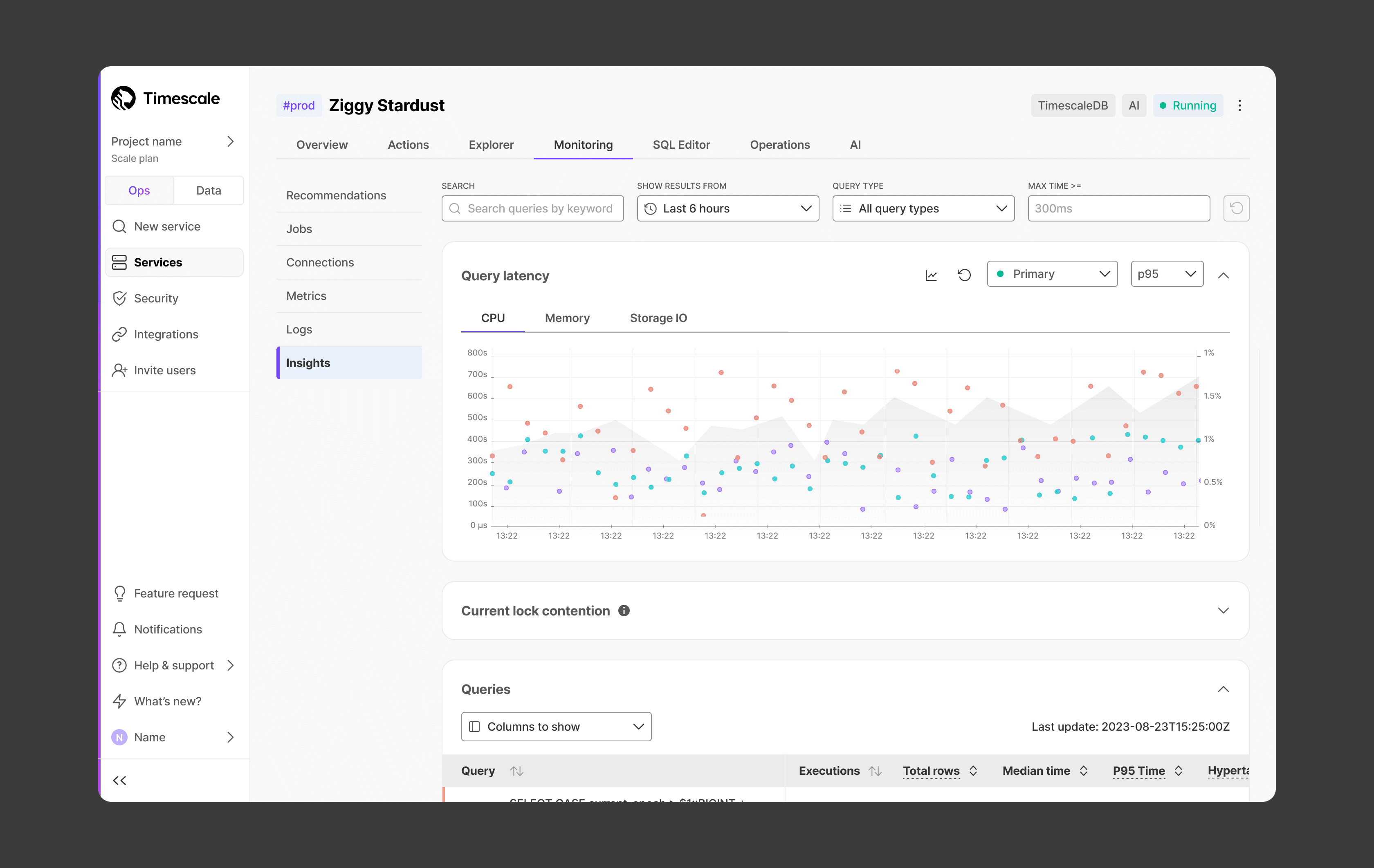
Below is an example of the old navigation, which relied on multiple layers including the main nav, top tabs, and an additional side nav. With all of these elements competing for space, the interactive graph and data table felt compressed. Important information was squeezed together, and horizontal scrolling was not intuitive.
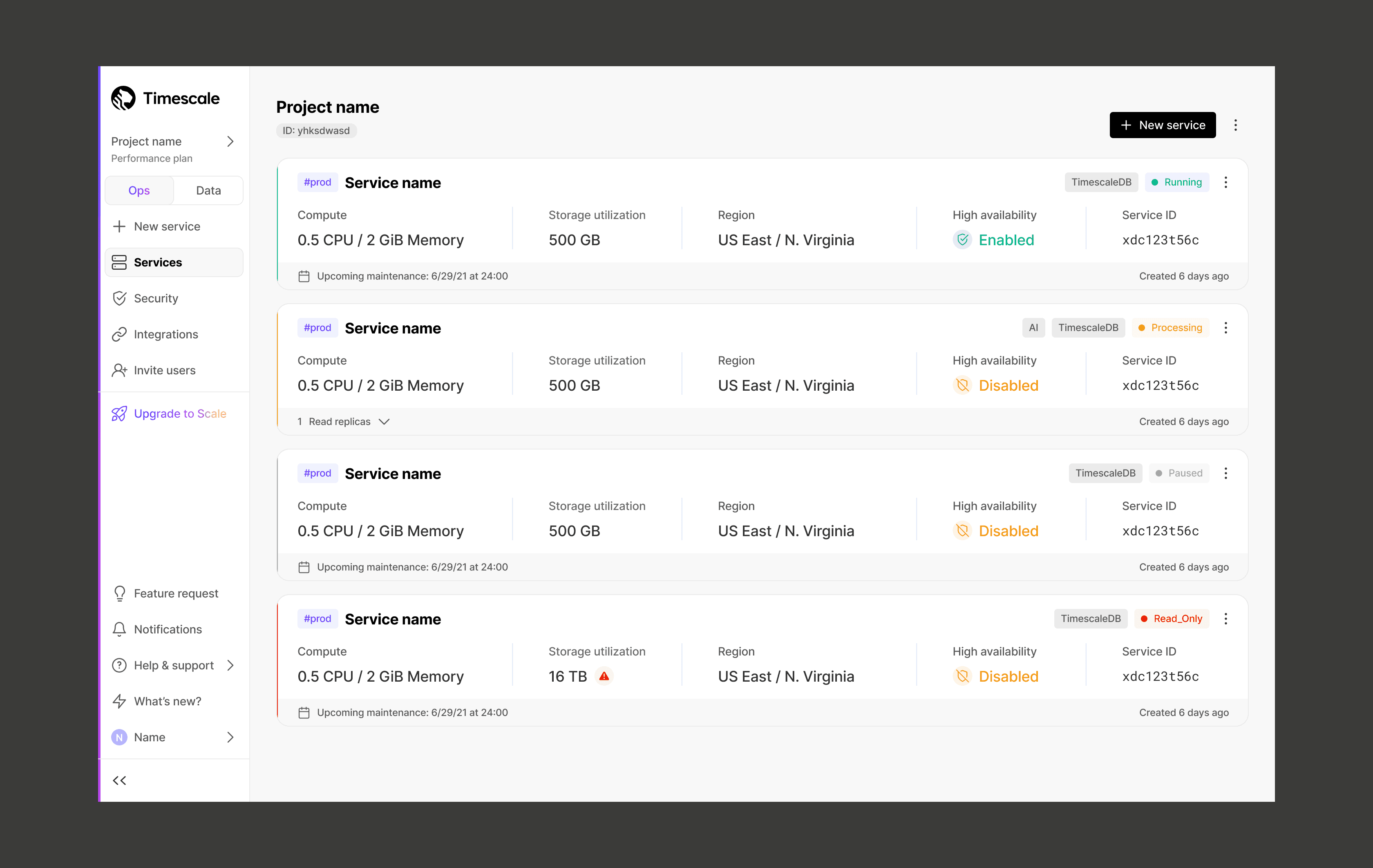
Here’s another example from the old navigation. Users often had trouble finding the billing page because it was buried inside the project selector in the main nav. To access it, they had to click through multiple layers, which made something straightforward feel unnecessarily complicated.
My role
During our 2025 Design Offsite, the Product Design team audited the information architecture and proposed a new direction focused on usability, discoverability, and long-term scalability. After the initial direction was defined during the Design Offsite, I expanded the proposal to cover additional use cases across the console. I worked closely with our PM and engineering team to validate what was technically feasible and where we needed to adjust.
I focused on translating the high-level IA vision into practical navigation patterns that could scale as new features shipped.
Solution
We implemented a top navigation layout that freed up space and created a clearer structure. It also aligned more closely with other developer tools, helping reduce cognitive load.
Key improvements included:
Replaced multi-level navs with a single top nav
Standardized project and service switching
Made frequently-used tools easier to access
The new layout makes it faster to move between projects and services without digging through multiple layers.
Examples
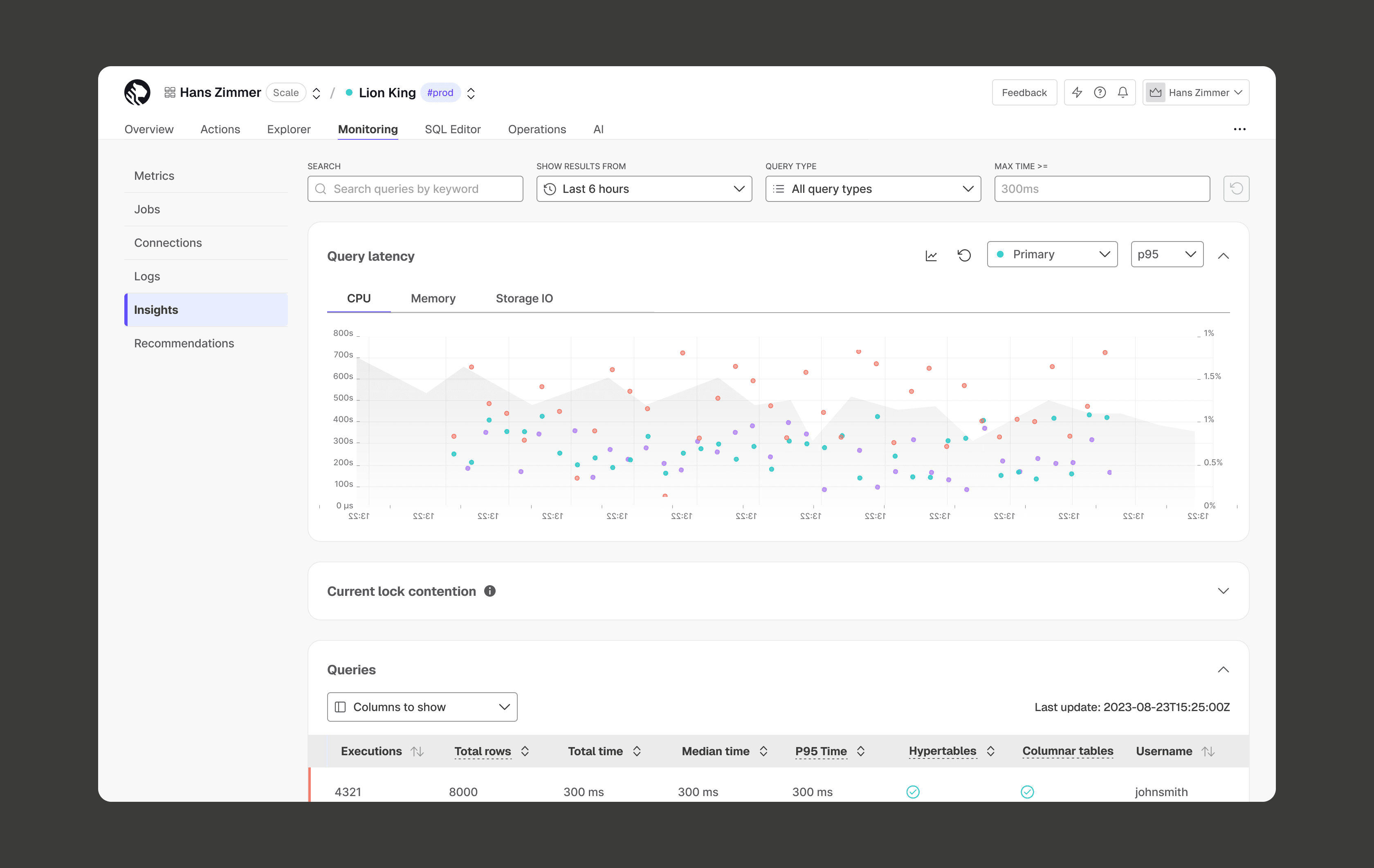
After the redesign, the interactive area was significantly expanded, giving the graph and table more room to scale across different screen sizes.
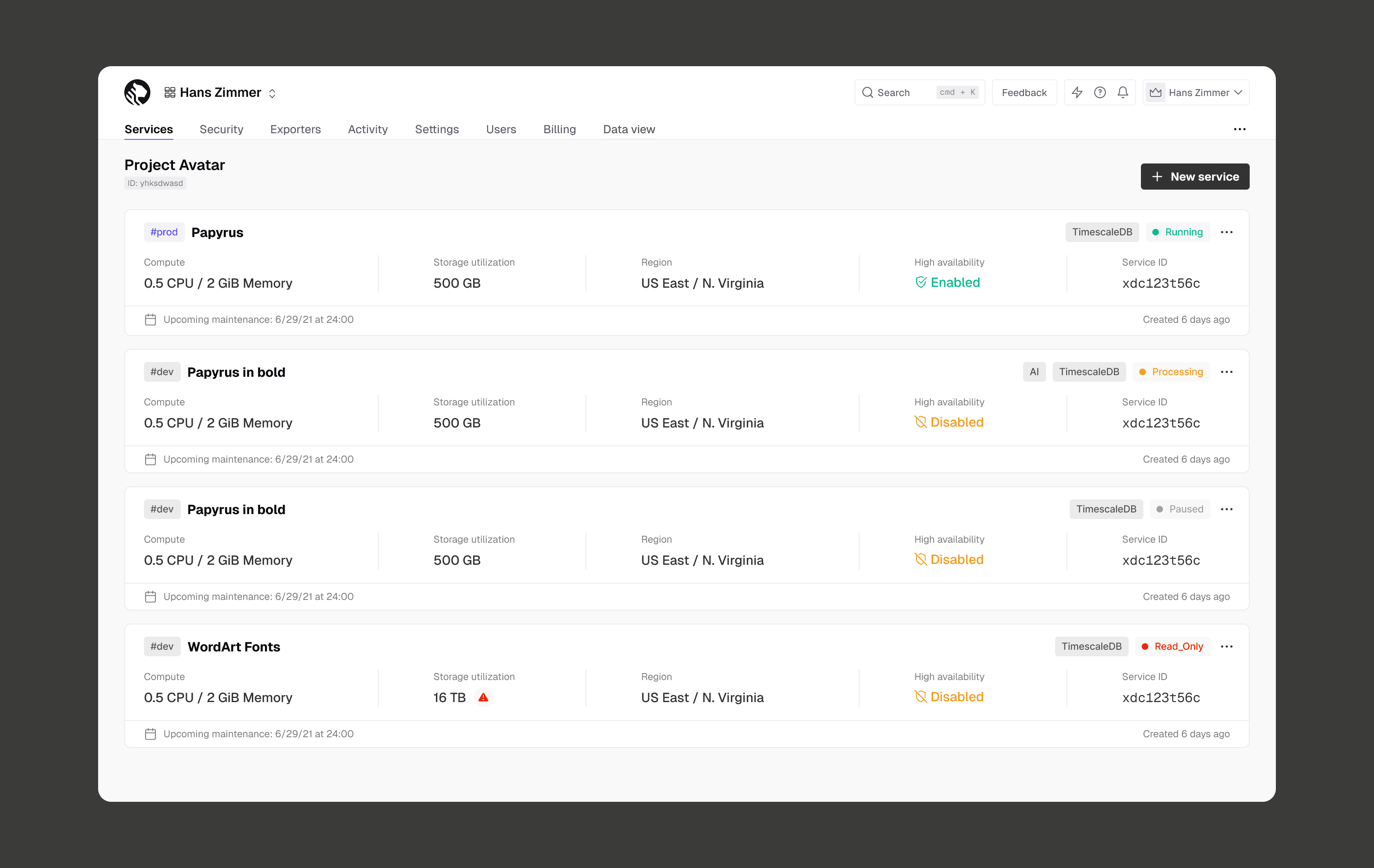
We also moved Billing out of the project selector and into the top-level navigation, making it easier to access and more discoverable. This reduced friction and saved users time when managing their account.
Impact
After launching, we conducted a survey with users who recently logged into the console to ask them about the new navigation. The responses were very positive and many users noted it was an improvement, with some calling it a "huge one," "cleaner UI," and "definitely an improvement over the previous version." Additionally, users noted that the navigation is now more visually in-line with other tools they use, which reduces mental friction in learning and using our product.
Next steps
Navigation is never truly done. Since launch, we’ve continued refining the experience based on feedback and usage patterns. This includes making high-traffic tools like the SQL Editor and Data View more visible and easier to access.
The goal is to keep evolving the system so it stays flexible as the product grows!